Retrograde Espresso Martinis
Branding | Logo Creation
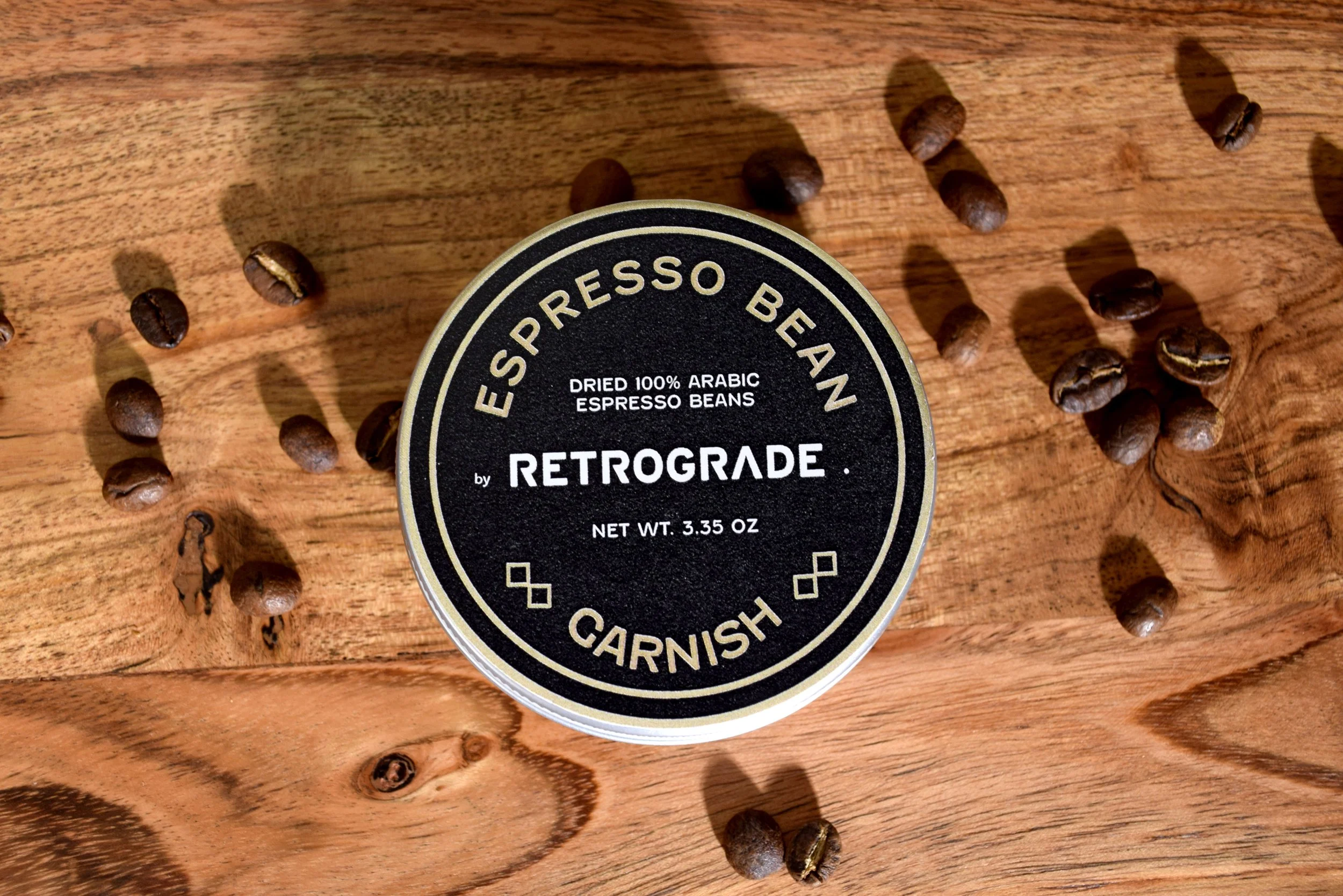
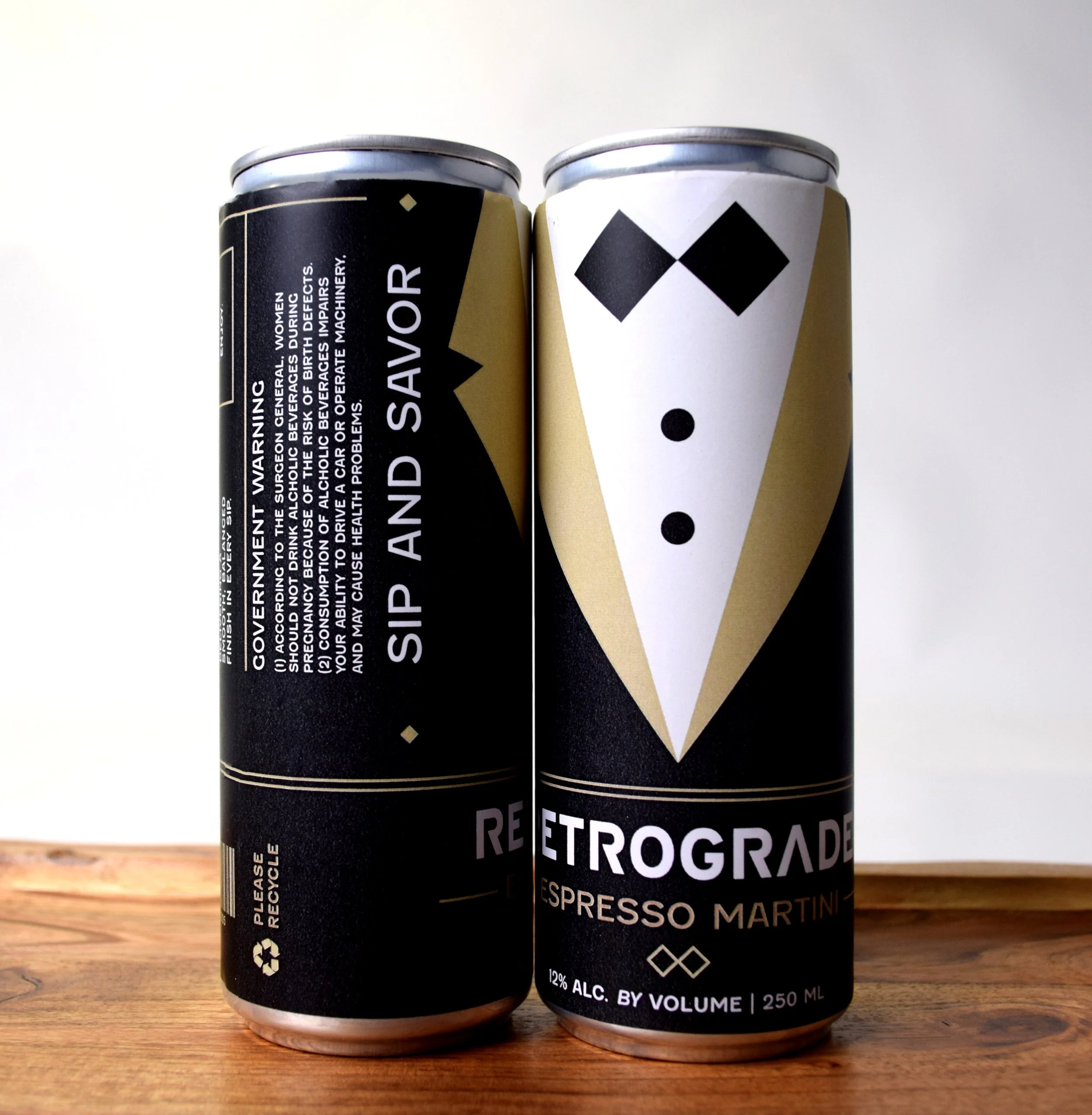
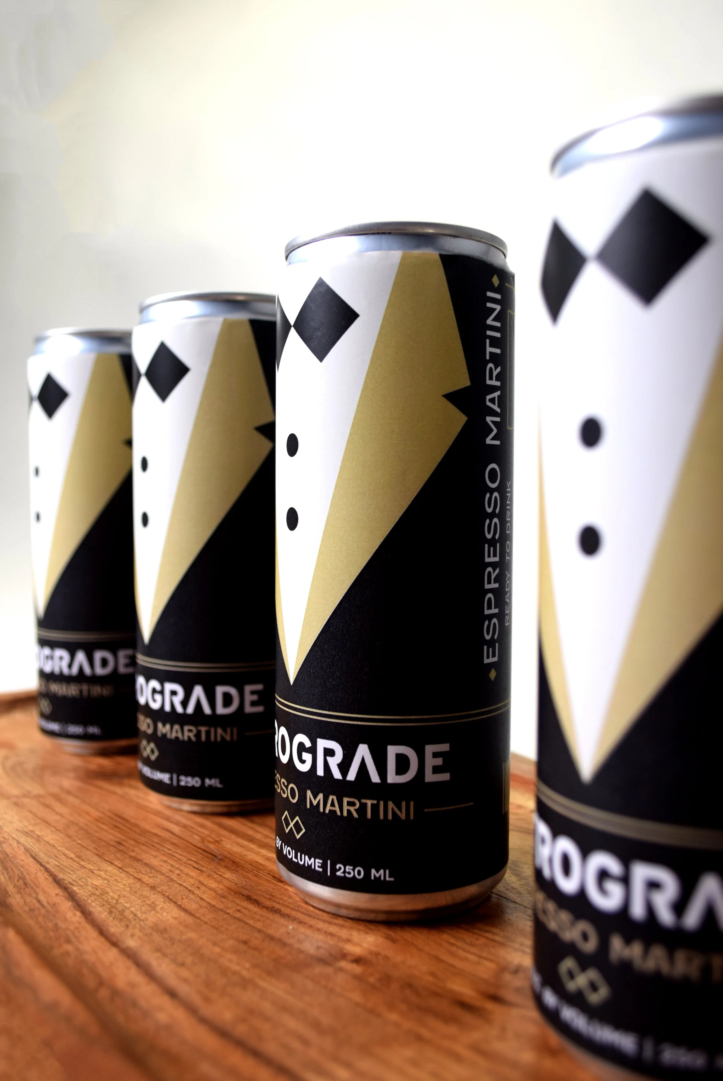
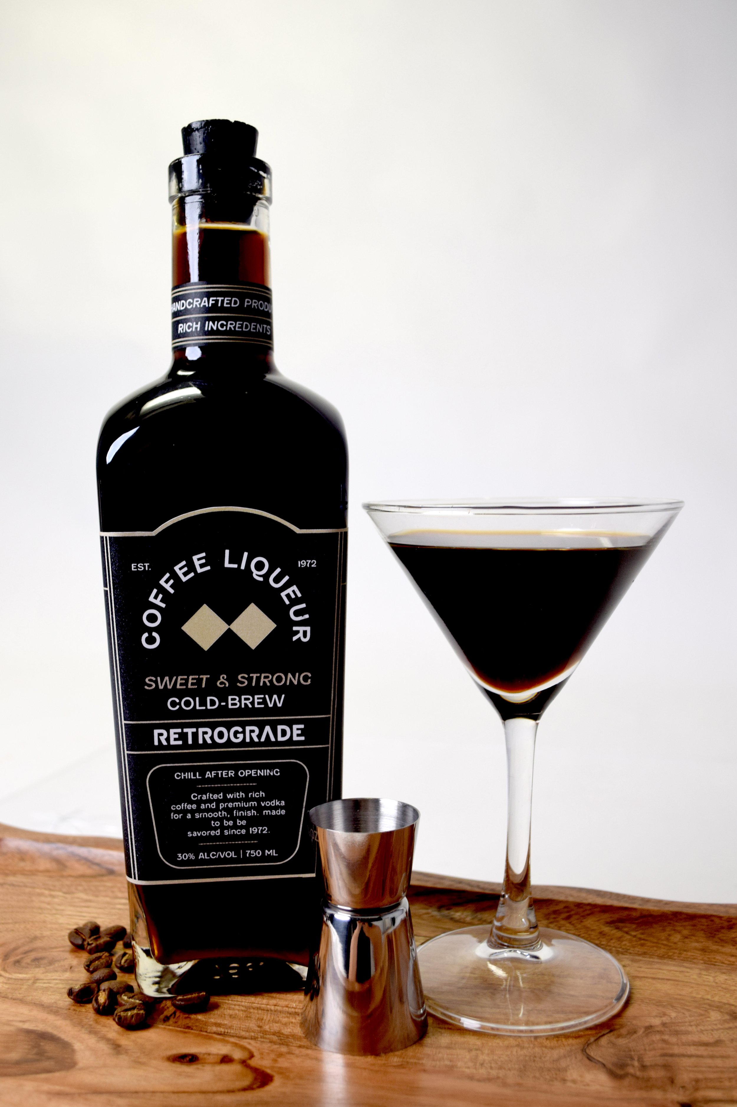
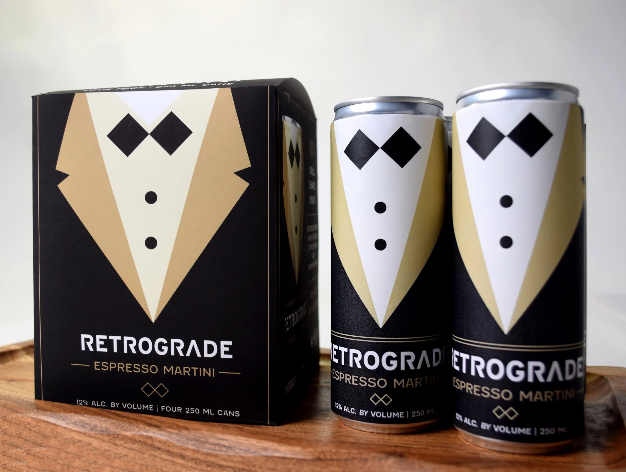
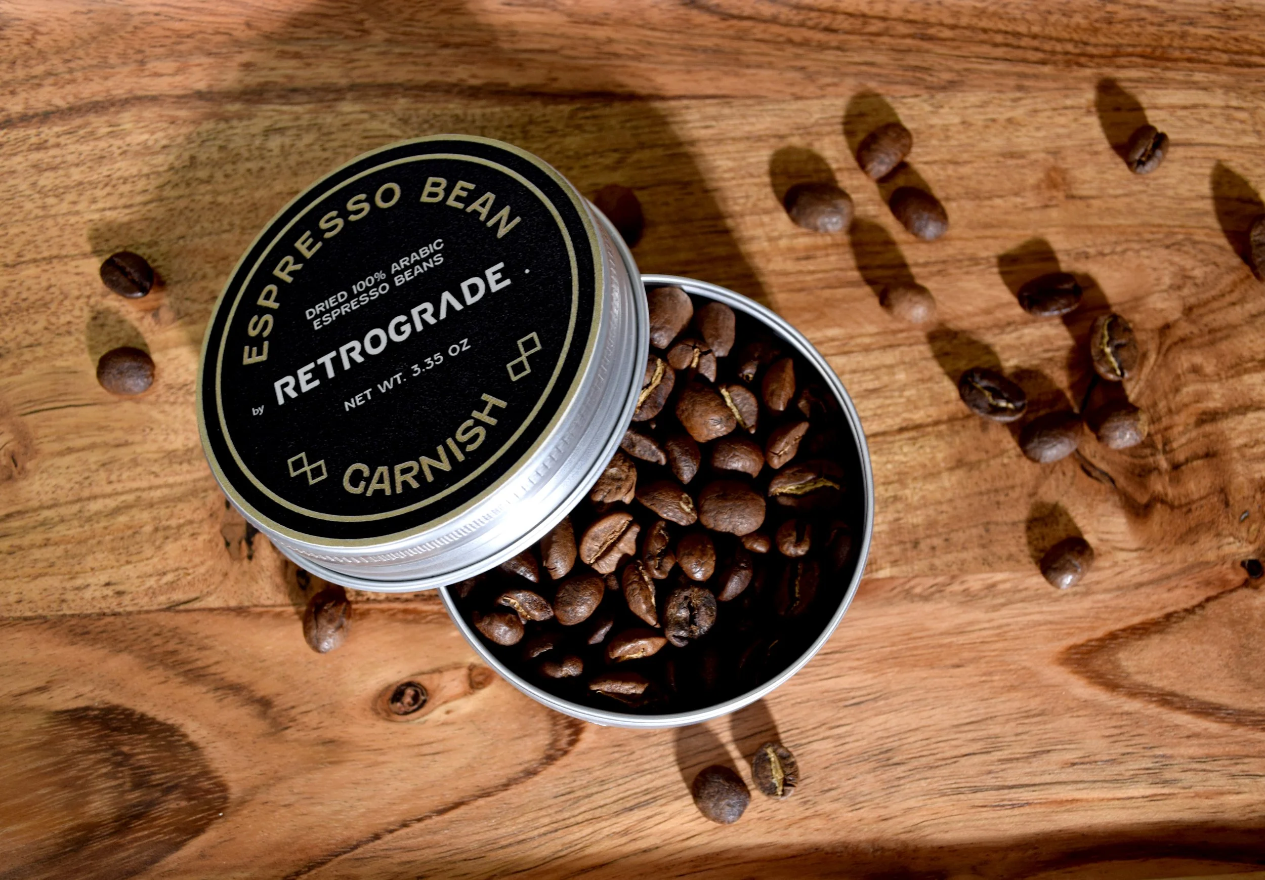
The creation of an espresso martini brand, Retrograde, to shape the espresso martini into an experience. Retrograde appeals to young adults who value aesthetic experiences. The project included a coffee liquor bottle, a can, a garnish tin, and a four-pack box to hold canned espresso martinis.
The Process
Exploration
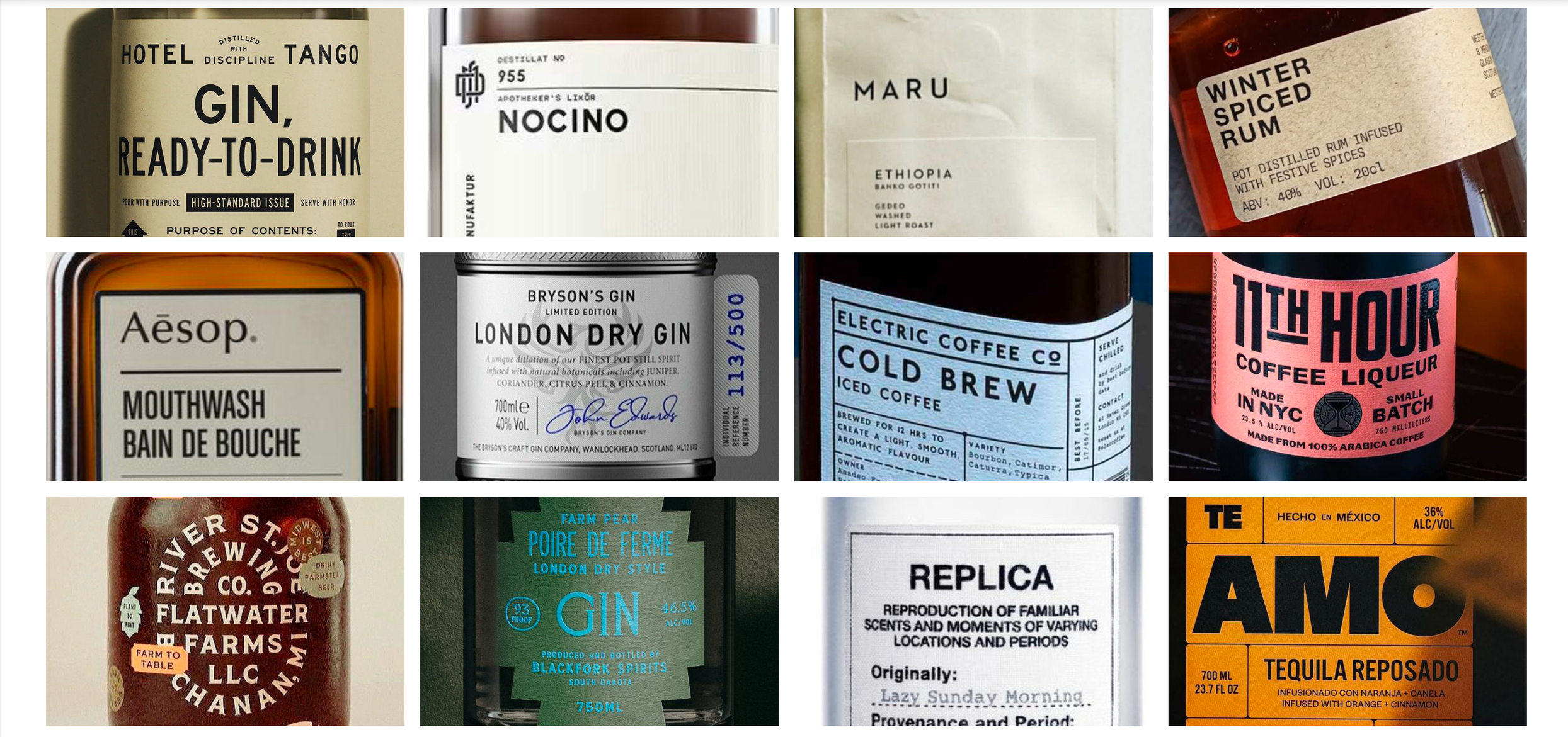
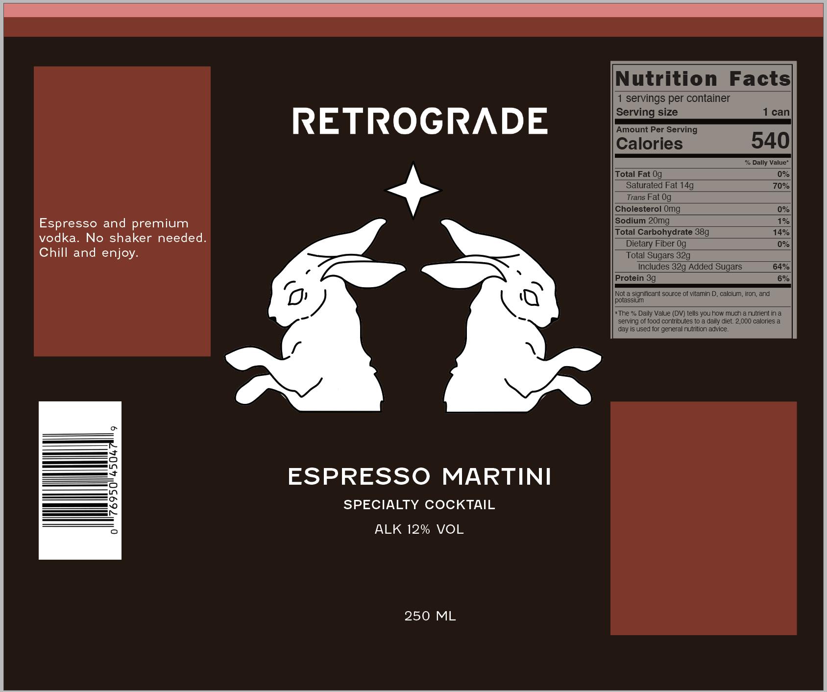
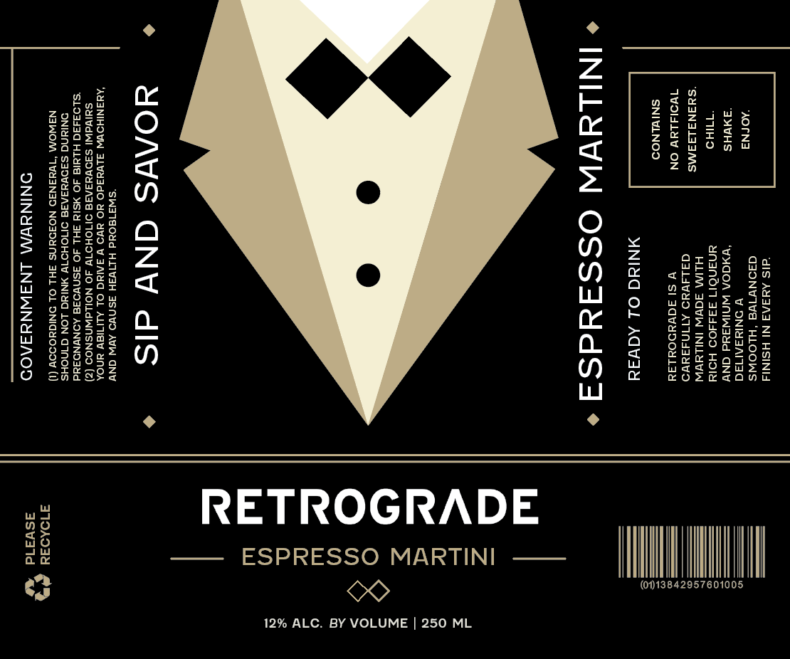
Initial exploration began with illustration and an emphasis on the word “retrograde”. Though the concepts were interesting, they did not convey the curation the brand needed. I began to move to the bow tie to represent how the brand leans into dark, formal nightlife aesthetics while introducing playful, simplified elements that appeal to a younger audience.
Drafts
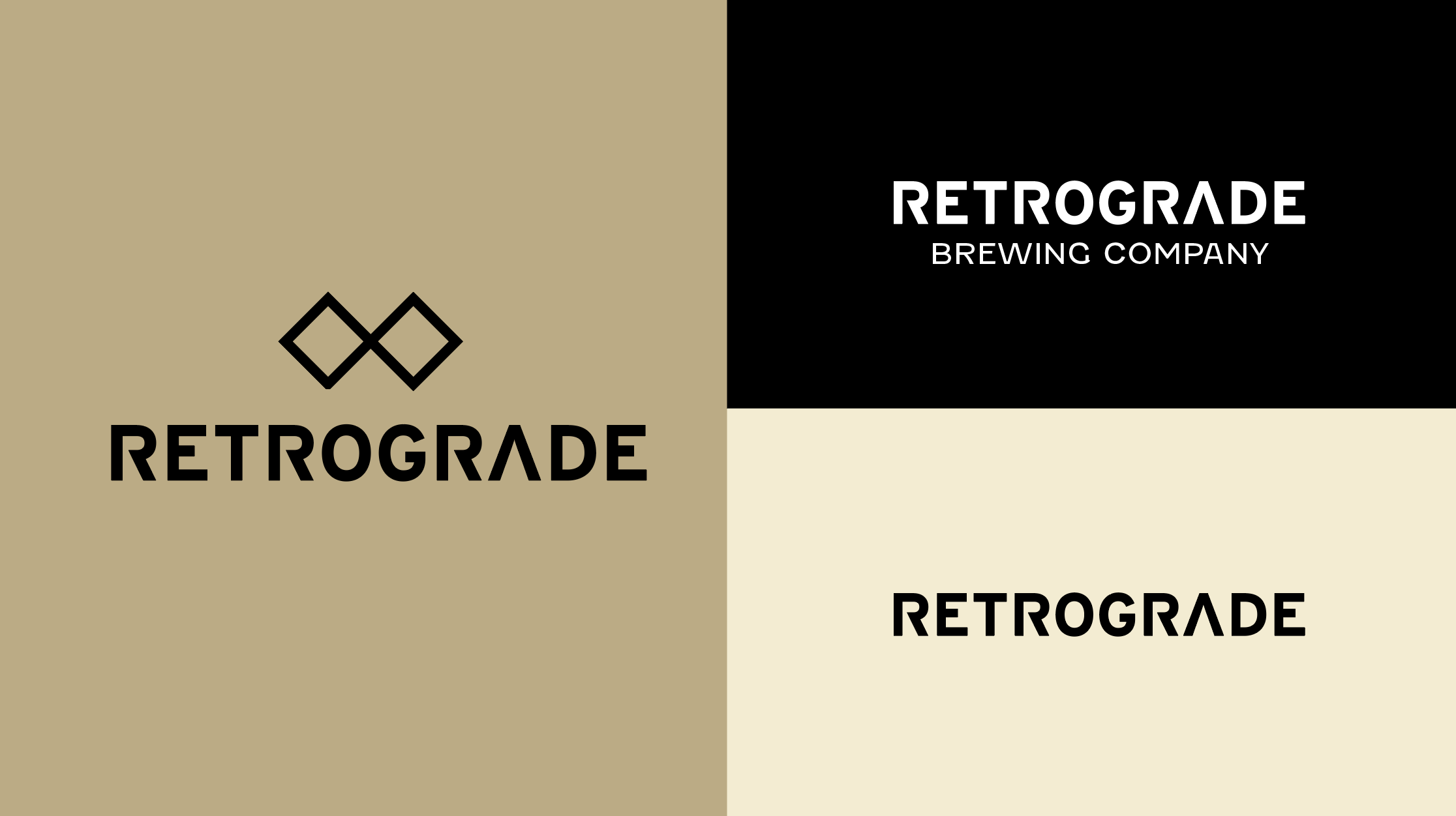
The sans-serif typeface, Interstate, allows for flexibility and pairs well with the other type used, Fenwick. Both typefaces introduce a clean, contemporary look that contrasts the brand’s formal visuals. The color palette is intentional, with black, white, and gold referencing both the espresso martini itself and the visual language of luxury and modernity.
Finalization
The patterns using the logo of the bow tie add a touch of refinement and cohesiveness that adds to the consumer’s feeling of purchasing an aesthetically driven product. The forms in the packaging design create alignment and visually relate the products to each other. This appeals to an audience seeking refined, thoughtful products.
I ensured consistency through a balance of typographic and illustrative focus and a strong use of color and type. I wanted type to play a large role in the aesthetics of the packaging and become a unifying aspect of the brand identity. The pieces are individual through their purpose and design, but also look unified together.