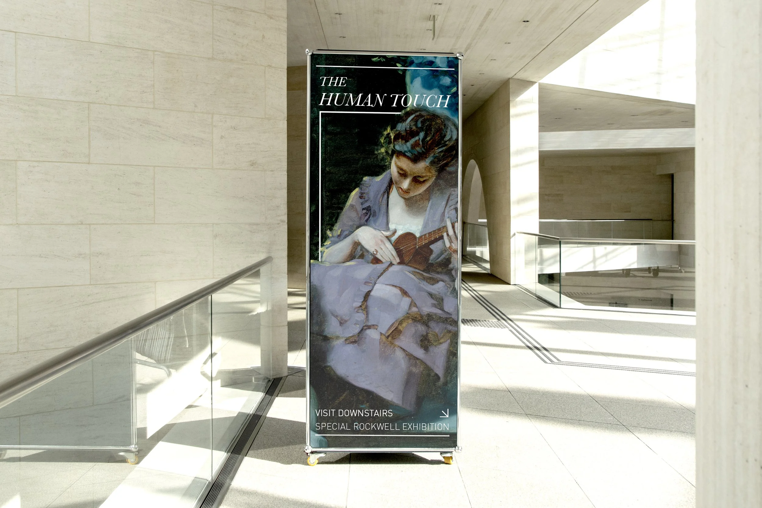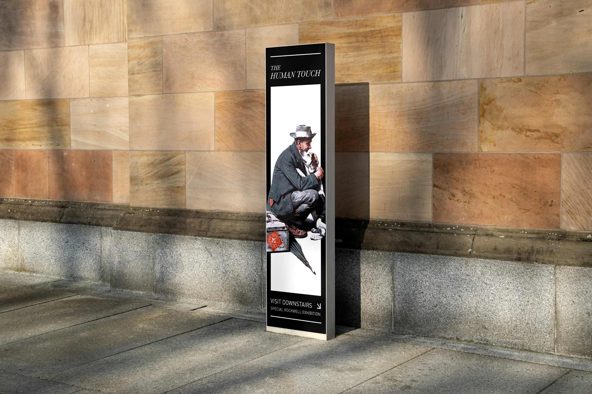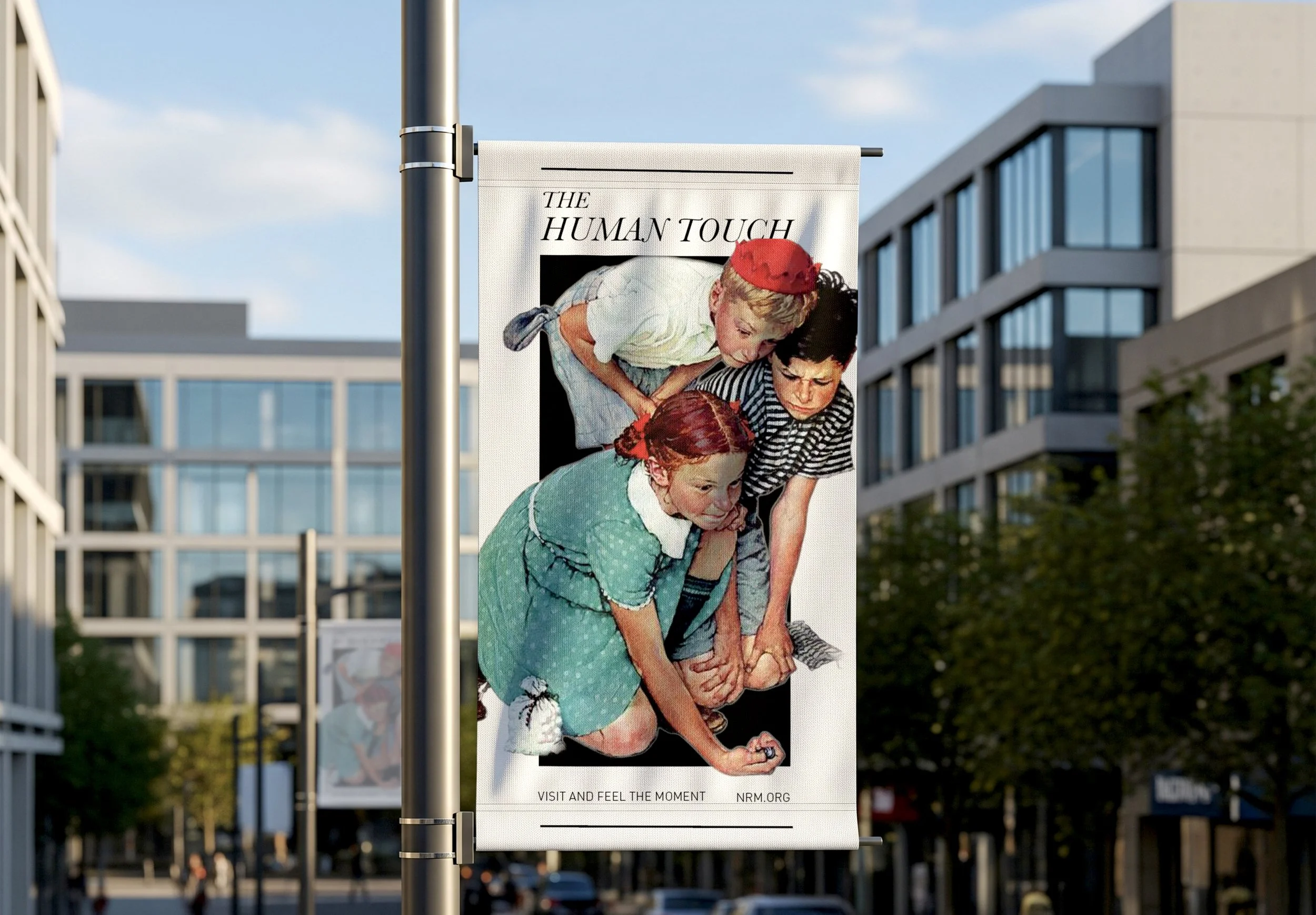
The Norman Rockwell Museum Advertising :: The Human Touch Exhibition
Adverstising | Posters | Mockups
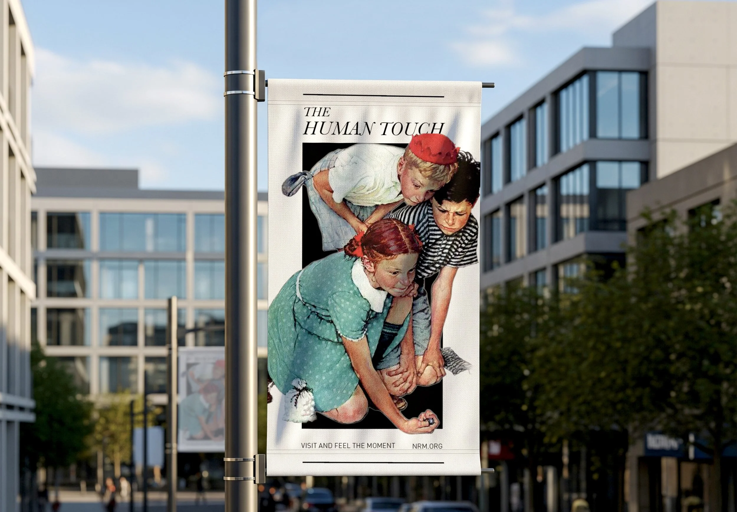
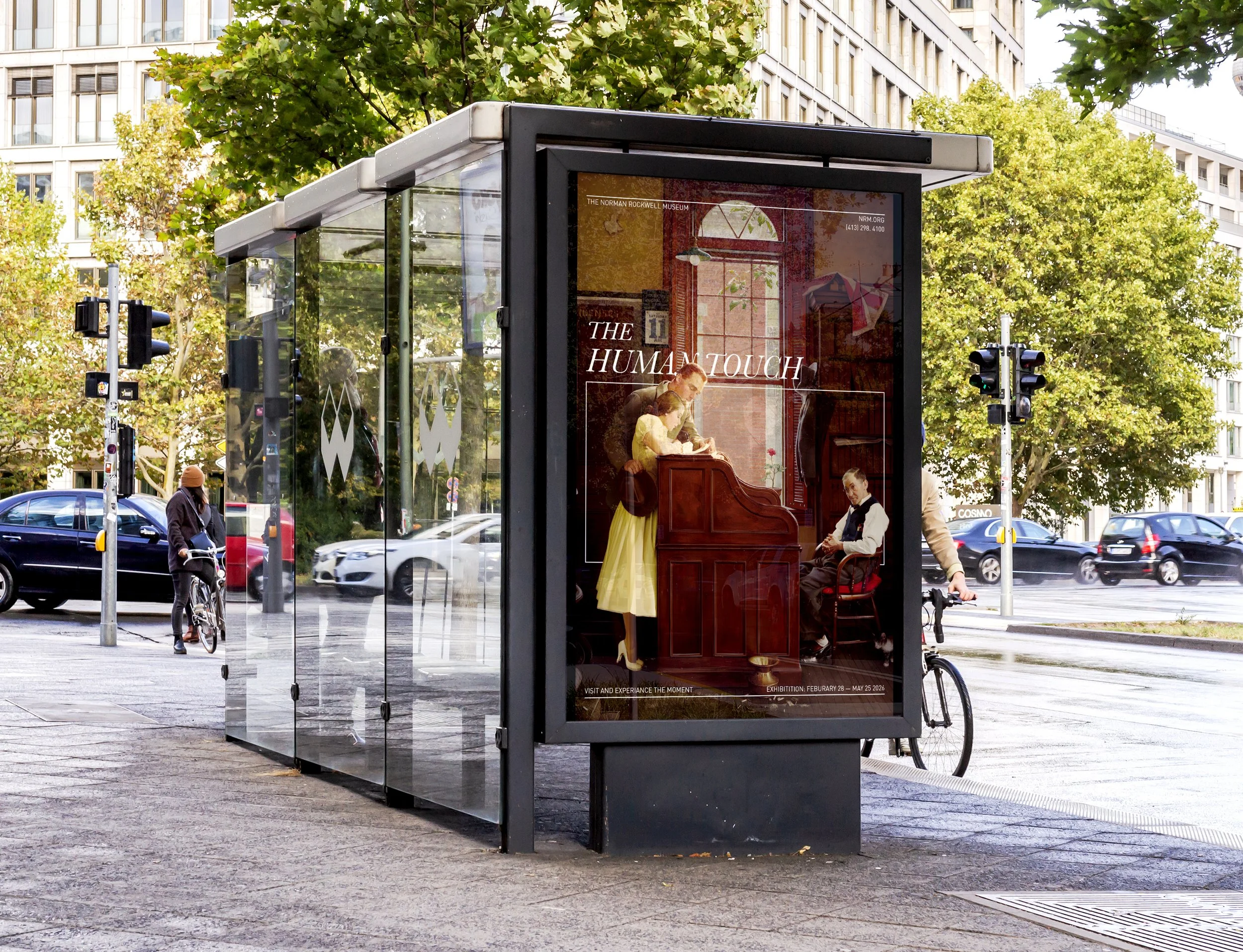
“The Human Touch” focuses on Norman Rockwell’s ability to bridge realism and idealization of American culture. The campaign for “The Human Touch” exhibit of the Norman Rockwell Museum draws on the artist, his legacy, and the meaning behind his work. The goal of the campaign was to allow the artwork to shine, allowing the viewer to feel the intimacy and storytelling of the artwork through design. The campaign appeals to viewers of all ages and aims to increase traffic to the museum.
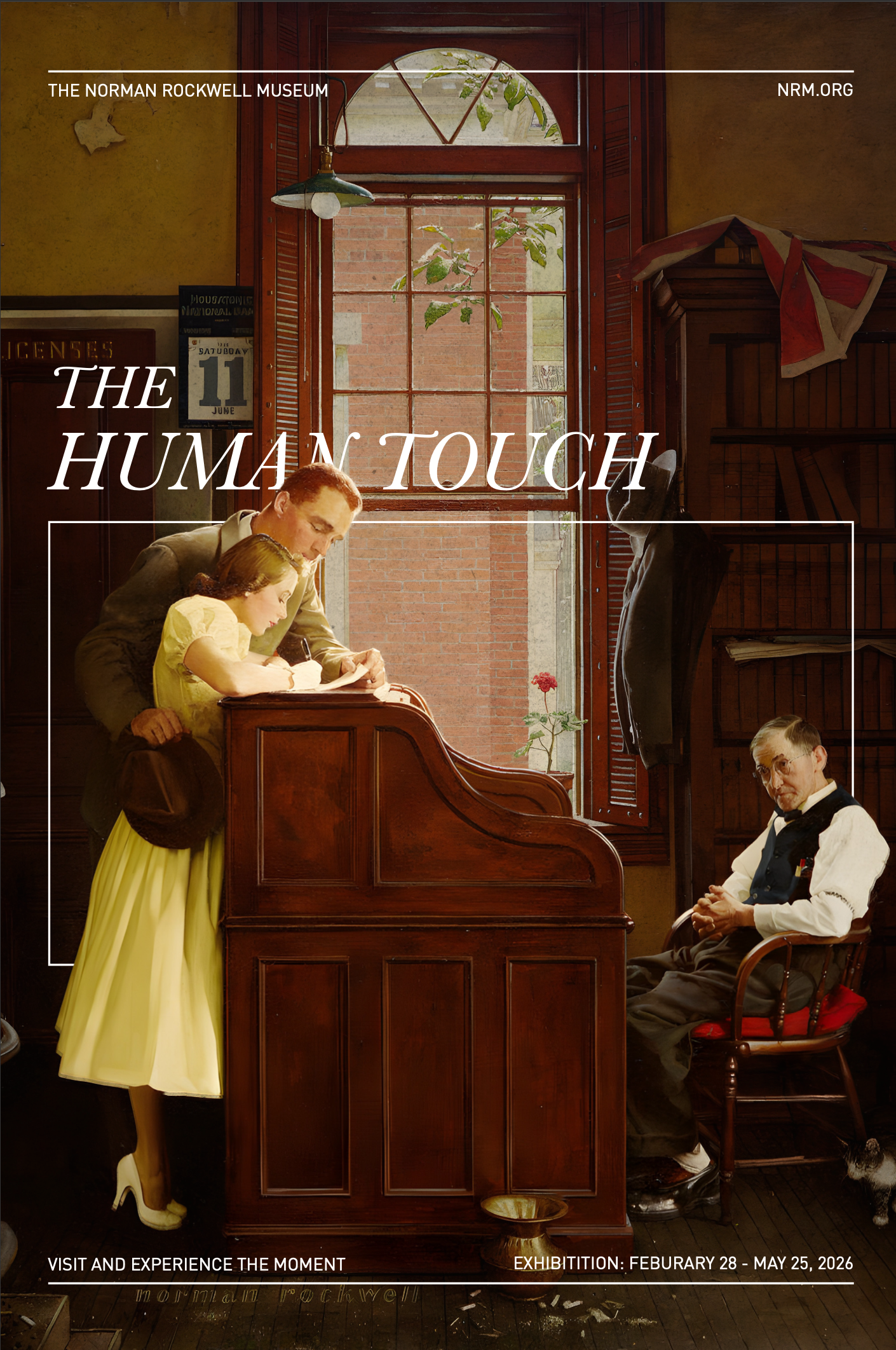
Exhibit Details & Feature Poster
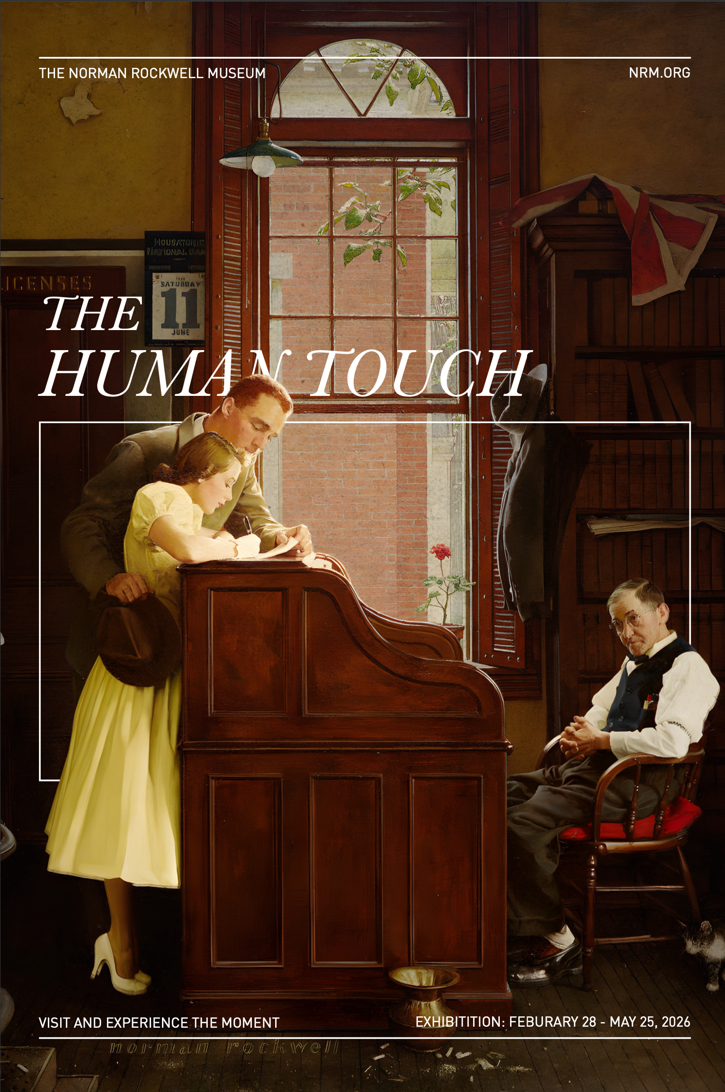
Norman Rockwell was an American painter and illustrator. He captured the essence of the American spirit through paintings of everyday life that spanned a time of political, technological, and cultural changes in American history. The Norman Rockwell Museum in Stockbridge, Massachusetts, seeks to preserve and exhibit the world’s largest collection of Rockwell’s artwork along with his personal materials and studio. The museum highlights education and the study of American illustration as well as Rockwell’s impact on popular culture.
The exhibit “The Human Touch” focuses on Norman Rockwell’s hopeful view of humanity and his ability to capture the complexity of humanity through small interactions. The campaign for “The Human Touch” exhibit of the Norman Rockwell Museum draws on this rich history and deep meaning in both the artist, his legacy, and the meaning behind his work. It calls on the viewer to experience the moments within the paintings, finding themselves in moments captured decades prior.
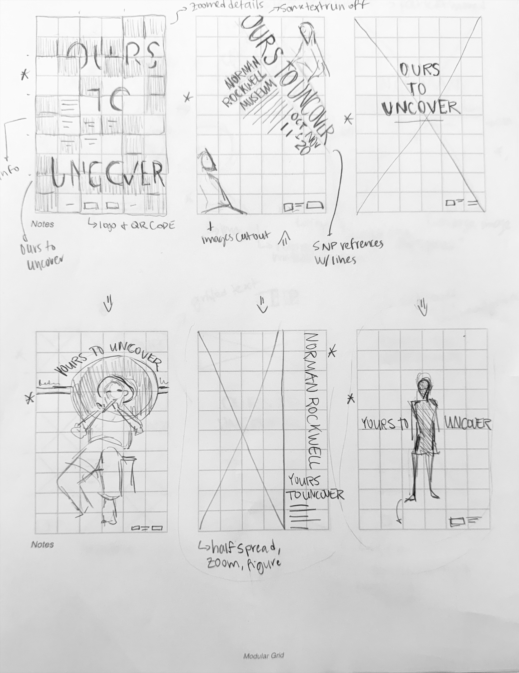
Thumbnails
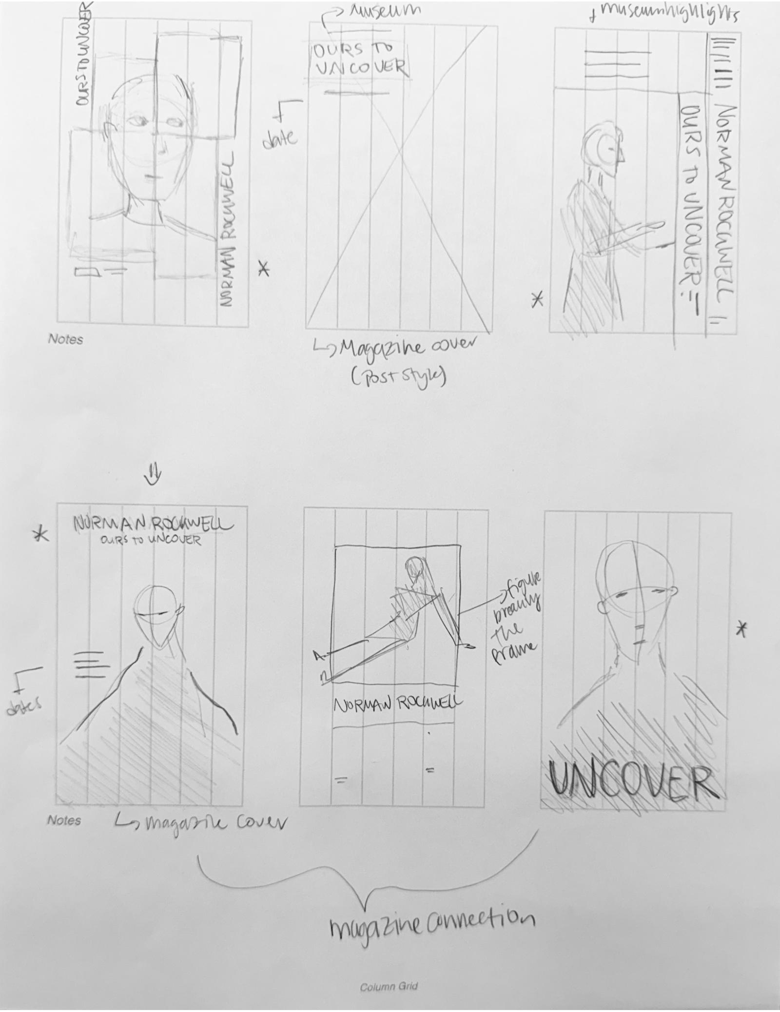
Process
Drafts
I initially chose to emphasize Rockwell’s “characters” from his illustrations, or the paintings in a rectangular grid; however, both of these did justice to the paintings and created the connection needed for the campaign. I chose to push the humanity and detail of the paintings through a minimalist design while allowing the paintings to shine, creating the connection for the audience.
Typography
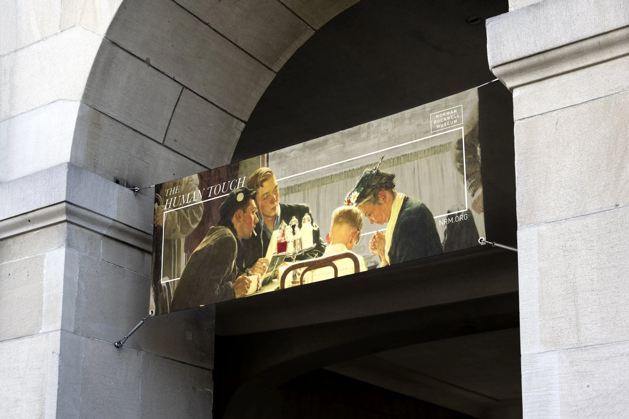
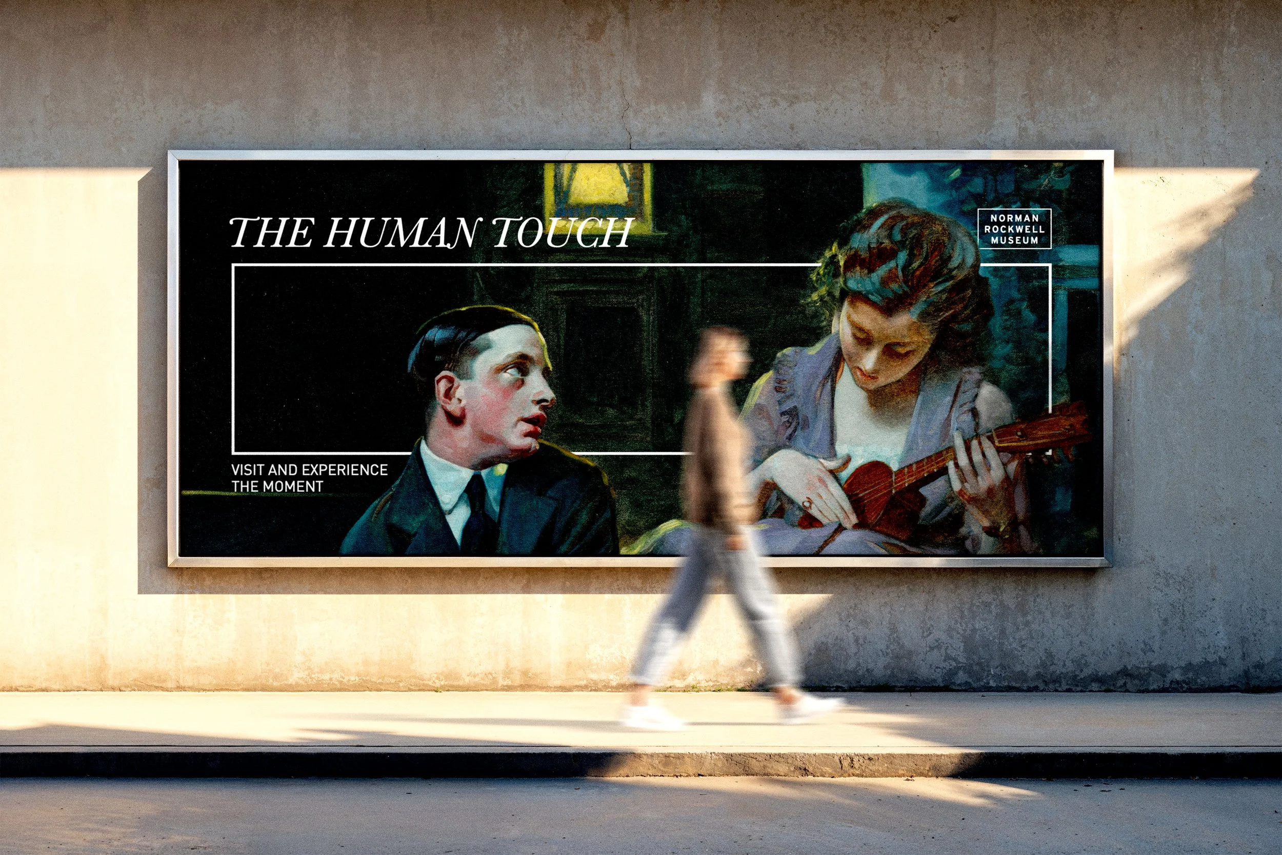
I chose a combination of serifed type, Baskerville, and sans-serif for secondary information, Din, which allows for an easy reading experience while meshing well with the paintings. I also created a white frame that draws attention to the connection taking place and references the lines present on The Saturday Night Post covers. I used black and white for fonts, and the linear elements allow for the paintings to shine and draw the viewer into Rockwell’s paintings. The frame also acts as a window into a different vision or experience, drawing the viewer into the paintings and inspiring them to come to the museum.
Finalization
I ensured consistency through the repetition of the frame element and repeated colors for the type and visual elements. The system remains the same as the paintings are interchangeable, making the campaign look unique and visually interesting while it can also stand alone.
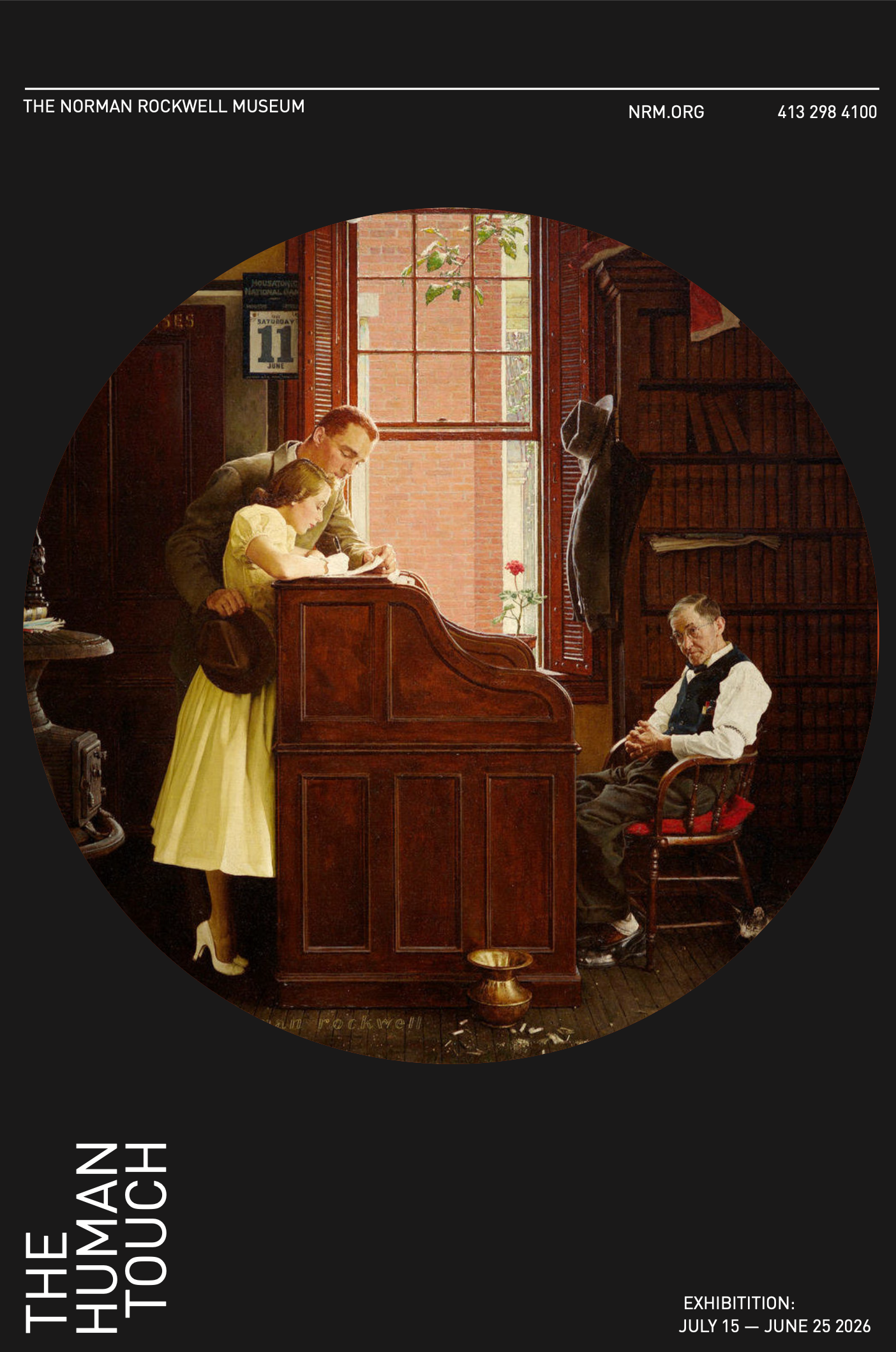
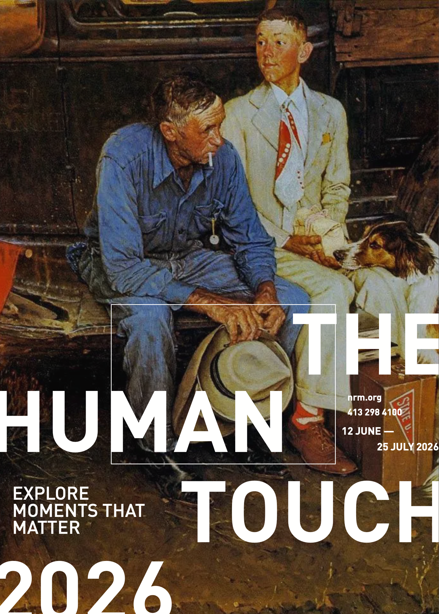
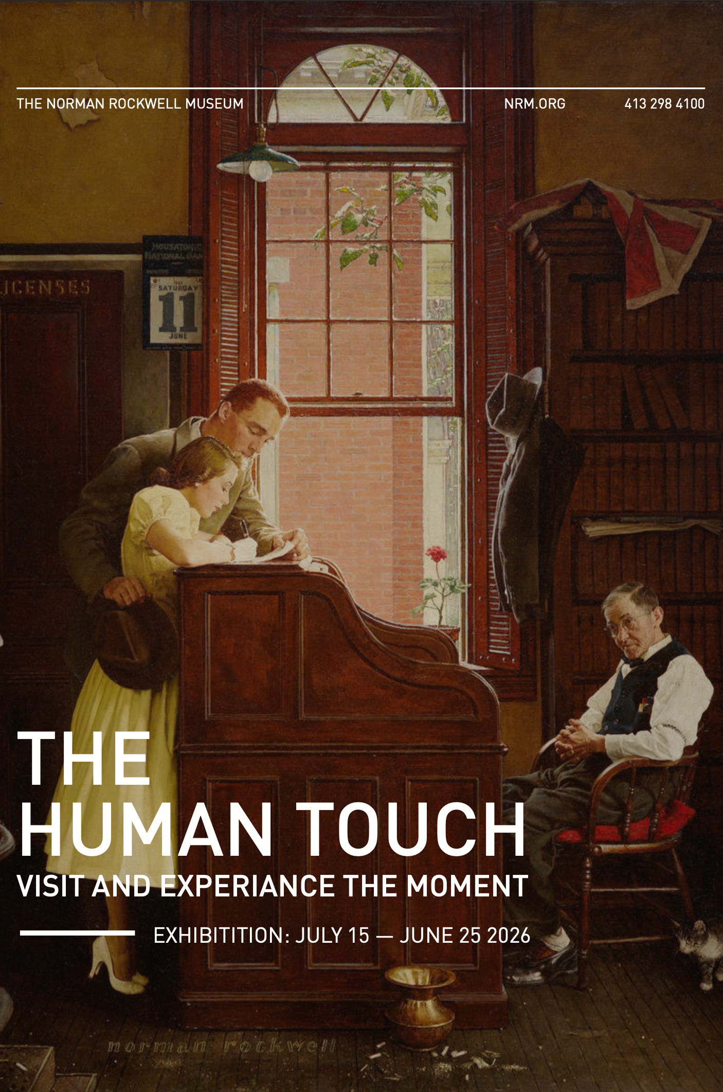
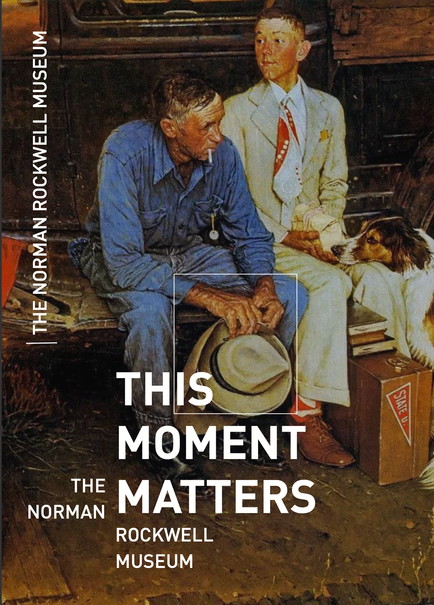
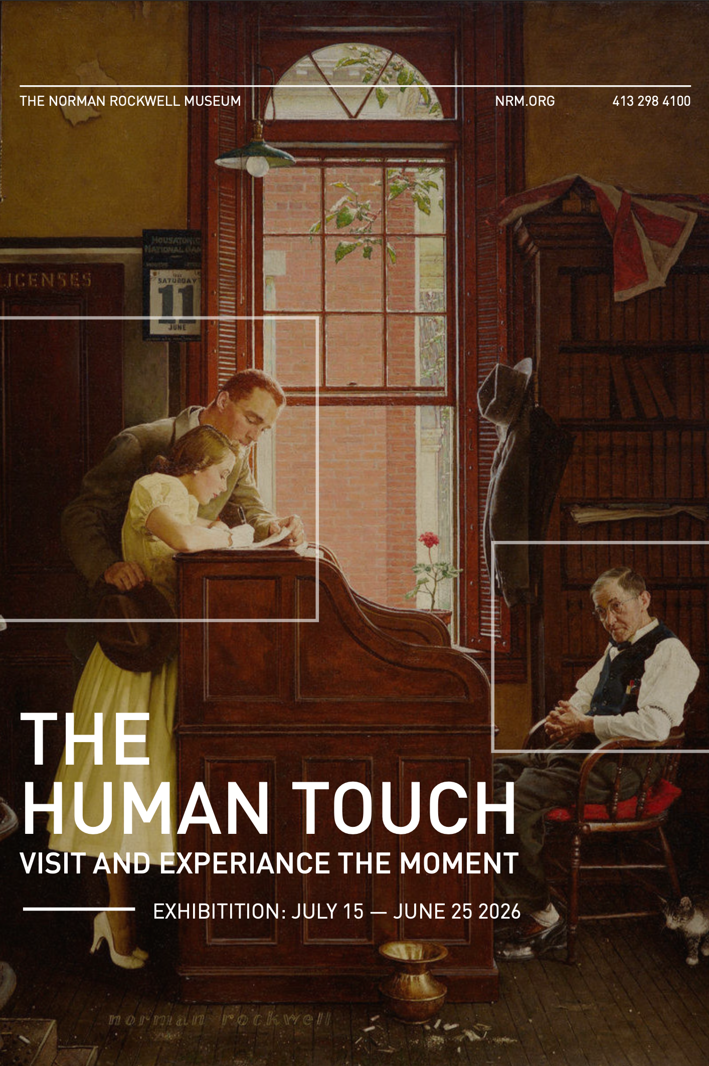
Final Feature Poster Detail View
Advertisement Mockups & Extensions